Showing posts with label Distress Ink. Show all posts
Thursday, 24 April 2014
More stuff from a while back
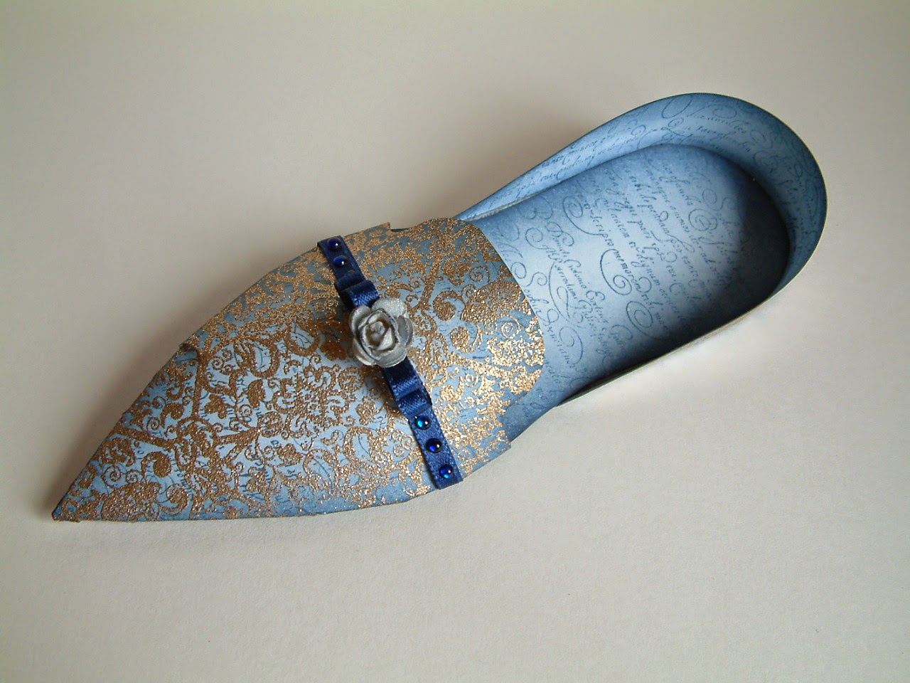
Recently I came across this paper shoe photo, sadly as my old computer died some time back, I have lost the book mark that took me to site the template I used came from. However if you want to have a go this free template from Chocolate Baroque is very similar.
Once I had cut out all the parts needed for the shoe from plain white card I coloured them by blending Chipped Sapphire Distress Ink onto each piece, then stamped over using a script stamp from the Eccentric Edwardian theme-plate currently available from Chocolate Baroque. On the outside upper and heel pieces I over-stamped and heat embossed with a gold sparkle embossing powder (my photo only shows the gold embossing on the upper, sorry). The stamp I used was from an Elusive Images set which I seem to recall was called Damask Delights, but does not seem to be one of the designs saved by Chocolate Baroque, however they do have this very similar stamp available. Some narrow ribbon, gems and a paper rose spritzed with Glimmer Mists provided the finishing touches.
Thursday, 13 March 2014
Retro Shadow Stamped Card
Friday, 22 October 2010
Elegant Ladies From Elusive Images
Elusive Images has just launched some lovely new A5 themeplates, each of which features a beautiful lady in a fabulous evening gown. Accompanying the lady on each of the plates are a lovely mix of swirls, ornate corners, chandaliers and candelabras. You can see the new stamp sheets in their full glory over on the Elusive Images Design Team Blog where, if you are lucky, you might win one of the themeplates in a random giveaway. You will also get to see some of the beautiful creations made by my fellow DT memebers to give you some inspiration. We all agreed that these stamps would be very pretty to use for wedding themes, making lovely cards to give to the bride and bridesmaids etc, but their versatility does not end there, as the samples shown on the EI DT blog show! The samples I made did wedding themed items, but this one is an any occasion card made when I gave in to my addiction to Vintage Photo Distress Ink and just had a nice inky play!
The stamp was stamped with the Distress Ink onto cream card, only stamping the upper part of the image. I blended more ink around this and also used the ink as a paint to add some shading to the lady's face and arms. The frame was cut using Nestability dies from more of the cream card which then had lots of that lovely Vintage Photo ink blended over it. The pattern on the frame was created by stamping the skirt part of the lady's ballgown in Versmark ink and dusting with Heirloom Gold Perfect Pearls. The frame is mounted over the image of the lady using foampads. The background is more cream card and paper from the Artylicious Decadent Brocade CD onto which I blended yet more of the Distress Ink. To finish the card I stamped a greeting, added some cotton lace and some amber coloured cabochon gems to the frame and as the corners of the backing paper.
Labels:
Artylicious CD,
Distress Ink,
Elusive Images,
Perfect Pearls
Sunday, 17 October 2010
Haunted House Card
The faux bleaching is done by simply painting clean water over the areas you want to remove ink from, then dabbing the area with a kitchen towel to remove the water and as much ink as you can. Because the stamped image has been heat embossed the inked background becomes slightly heat set and you don't remove quite as much colour using this technique as you would from unheated card. For that reason I used real bleach to take almose all the colour away from the moon area. Once dry the card was dry, I blended Black Soot Distress Ink around the edges then mounted the finished image onto a mat cut from dark green foiled card.
Labels:
Cosmic Shimmer,
Distress Ink,
Elusive Images,
Halloween Card
Tuesday, 12 October 2010
Things That Go Bump In The Night
This card was made using Hallowe'en themed stamps from Elusive Images. The the toadstools, the spider web on the corners and the greeting all came from the Halloween Candle Themeplate.
To make the card I stamped the toadstools onto white card using black Adirondack Dye Ink. Next I added spots over the tops of the toadstools using a Versamark Pen, then sprinkled clear embossing powder over the image and heated it. With the spots of clear embossing in place I coloured the image using Copic markers then coloured over the whole image with the Versmark pen, coated the image with clear embossing powder and heated it up. The clear embossing was to provide a resist so I could ink the background around the toadstools.
The background was inked first with Pine Needles Distress Ink, blended right up to and over the image. Next I blende some Dusty Concord around the outer edges of the image, then wiped the ink away from the clear embossed area. I stamped the branches of one of the trees from the Arboretum Design-A-Tree themeplate around the edges and inked up just the spider dangling from it's web on the large Candle stamp in the Hallow'en Candle set and stamped it in to look like it was dangling from one of the tree branches.
I made a card blank from some black card and added mats and layers in orange and purple card. On the purple layer I blended Dusty Concord and Black Soot Distress Inks around the edges and stamped and embossed the greeting with black embossing powder. The corners were cut from some of the orange card and stamped with the spiders's web stamp. Finally I added some Black Diamond Stickles Glitter Glue around the corners and around the edges of the mat and some black brads.
Labels:
Distress Ink,
Elusive Images,
Halloween Card,
Stickles Glitter
Thursday, 16 September 2010
Trick or Treat Part 3 - Found that Blog Candy Yet?
We have been having a lot of fun on the Elusive Images Design Team for the last few weeks playing errr I mean working hard, making samples with Hallowe'en themed stamps. A dirty job for sure, but someone had to do it [Grin]. Today I thought I would share one of those samples with you. The card was made using stamps from the Twilight Zone and Spookylicious themeplates, and paper from the Artylicious Essence of Nature CD. I also used Distress Inks and Twinkling H2Os.
Right now we have a fun blog hop running for anyone who wants to win some hallowe'en themed blog candy. Now the candy is hidden, not every Design Team member has any, some do, some don't. The challenge is to find the blogs with the candy. To give you a helping hand, here is the link to my blog candy post - be sure to follow the instructions in the post if you hope to find that blog candy!
Of course I may or may not have candy, so to be certain of being in with a chance to win some of these spooktacular Elusive Images Hallowe'en themed stamps you will need to visit the Elusive Images Design Team Blog and also the blogs of the other DT members - you can find their links in my side bar and on the main post about the Blog Hop on the Elusive Images Design Team Blog. You only have a day or two left to find that candy, as the winners will be drawn on Friday 17th September 2010. Good Luck in the hunt!
Labels:
Artylicious CD,
Distress Ink,
Elusive Images,
Twinkling H2Os
Thursday, 5 August 2010
Seashell Stepper
This is another of the cards that I made as part of my submission for the Elusive Images Design Team. To make it I used Elusive Images stamps from the Underwater and Seashell Collage themeplates, both of which are available from Graphicus. This was one of those cards that seems to take over once you start making it, and ends up being very different from the card you first imagined in your head.
To make the card I started with an A4 sheet of ice blue pearlescent card onto which I stamped the large corner stamp of the shells and seaweed and embossed with detail silver EP at the bottom right corner. With that done I cut the lines needed to free the middle section of the card from the outer edge, freehand cutting the curve around the edge of the stamped image and scored the lines across the card needed to create the stepped folds. With that done I stamped and embossed the little silver seahorse on the right side of the card and then folded along all my scored fold lines.
The card was finished off by making a greeting for the back step using Nestabilties dies to cut and emboss another piece of my Distress Ink coloured card onto which I stamped a greeting using a stamp from Clarity Stamp. I used a little Stormy Sky Distress ink to blend around the edge of this to pick up the embossed detail from the die. If you look closely there are also some small shells stamped randomly in the same Distress Inks used to give the card it's colour, not sure if they really show up in the photo. This was layerd onto some scalloped mats cut from more of the the same ice blue pearlescent card I made the step base with and another cut from silver foiled card. and stuck to the back step of the card .
For the seashells I used Distress Inks with the wrinkle free technique to colour some white card. The ink colours are Tumbled Glass, Spun Sugar and Bundled Sage. Once that was dry I used detail silver EP to emboss the various shell and starfish images onto it and then cut them out. I glued all my cut out shapes to the front and middle steps of the card.
Monday, 2 August 2010
More from the Sea
While I had been toying with watery themes it had occured to me that I have the Cuttlebug "Tiny Bubbles" emobssing folder and that if I coloured some silver foil card with Alcohol inks I could make a lovely bubbly background for something. I used Stream, Stonewashed and Lettiuce alcohol inks to colour the silver card, cut a shape using a nestabilites die and cut a frame with the same dies from plain silver card. The background shape was then embossed through the Cuttlebug folder to create the bubble texture. I stamped and heat embossed the little seahorse from the Elusive Images Underwater themplate onto an assortment of card using different embossing powders and cut them all out to find the one I liked best against my background.. My final choice was white EP on white card. With all my bits made I assembled the frame and background and stuck the little cut out seahorse into place.
Next I needed something to mount this onto, so I made a background blending Broken China, Stormy Sky and Shabby Shutters Distress Inks onto some card. Once the inks were dry I stamped one of the seashell images from the same Underwater themeplate and embossed with white EP. I mounted this onto white card stock, added a band of silver card across the centre with some white spotted organza ribbon then finally stuck the framed seahorse over this.
Friday, 30 July 2010
Getting Grungy
The image was stamped with Vintage Photo Distress Ink and I used a wet paintbrush to drag colour from the stamped outline to create extra shading in the image. Where I needed more shading I dabbed the ink pad onto my craft sheet and used my wet paint brush to pick up a litte more colour. If you look carefully there is also a tiny touch of Aged Mahogany in the image. The ink was very watered down on my craft sheet then picked up on my paint brush and used to make the sails on the boats stand out just a little more. Once the image was dry I used the blade of my scissors to distress the edges a bit then used Cut 'n' Dry foam to blend more ink from the Vintage Photos pad around the edge to create a vignette effect. Finally I dragged and smudged my Versamark pad around the edge, sprinkled on Gold EP and heated.
The finished image was mounted onto black card which I embellished with some kitchen twine that had been grunged up to look like old dirty ropes from a sailing ship. I did this by using just about every shade of brown distress ink I own, from Frayed Burlap to Brushed Corduroy! It was easy enough to do, just splodge the brown inks onto a craft sheet, spritz liberally with water then roll and scrunch the peice of twine around in the inky puddle so it soaks in the inky water. Let it dry then repeat as needed to darken. Once the twine was nearly dry I made the browny shades more uneven by smudging a little ink directly from the ink pads onto the twine and lightly spritzing so as to make the inky smudge bleed into the twine more - it bleeds better if the twine is still a little damp when you do this. The knots were tied using an authentic sailors knot - in this case a figure of eight knot. I wanted the knots to be the Real MaCoy, so I did some research online and found this web site with some great instructions on how to try proper sailors knots. Just click on any of those knots and an animated page opens that shows how to tie the knot.
Finally my background layer - once again I turned to my Distress Inks in assorted shades of brown and used the wrinkle free technique to create the background. Once this was dry I overstamped with Versamark using an anchor image from the Seashell Collage themeplate and dusted this with Heirloom Gold Perfect Pearls then very lightly spritzed with water to set the Perfect Pearls. The edges were treated in the same way as the edges of the main image - distressed with the blade of my scissors, a little ink blended with Cut 'n' Dry foam, and smudgy gold embossing. The whole thing is mounted onto black card from the same stock I used to mat under the main image.
If you got this far, sorry it's such a long post, but I wanted to share how I made this card because I had a lot of fun making it!
Sunday, 13 June 2010
Nautical Card
I stamped the lighthouse scene image using Broken China Distress ink, used a wet paintbrush to draw a little colour into the image to deepen the shaded areas, and finally blended a little more of the distress ink around the edges. The shell stamp was stamped with Versamark ink onto brown bazzill card and then heat embossed with clear embossing powers. The sentiment comes from the Seaside Scenes plate and was also stamped with Broken China Distress ink. Some brads and ribbon in a shade that complimented the colour of the ink added a finishing touch. Then, just because it was for Fab, and because he not only knows, but actively enables my weakness for sparkle I added the tiniest amount of Broken China Distress Stickles to the roof of the lighthouse. I guess it wasn't really necessary, but it's a sort of signature from me to Fab.
Wednesday, 8 July 2009
Playing with Backgrounds
The matting layer is also a fun background technique - I used Cut and Dry foam to blend Distress Inks (Faded Jeans, Dusty Concorde and Vintage Photo) onto some white card in a random way then spritzed this with water. Next I used a fairly wet sponge to dab on gold mica poweder from the Luminarte Polished Pigments range and then spritzed this again - this makes the Distress inks move some more and they carry the mica with them giving a lovely diffused look.
The card base is cream card which I have stamped with the same stamps as used for the main image using the Wild Flowers Adirondack Rainbow pad.
Labels:
Adirondack Rainbow Ink Pad,
Background,
Brayer,
Distress Ink,
Luminarte
Tuesday, 16 June 2009
From One Tough Card to Another.....
The background for the heart was made using Distress Inks and the "Wrinkle Free" technique - one of the techniques we played with at the recent workshop I went to. The colours used were Faded Denim, Broken China and Peeled Paint spritzed very liberally with loads of water. Once this was dry I stamped and embossed a lovely leafy flourish heart which can be found on the Harlequin Rose themplate using Gold Embossing powder then spritzed it with Glimmer Mist - the colour was Sea Glass.
Finally I cut out the heart and mounted it with foam pads onto some dark blue Moondust card from Southfields - it's a gorgeous deep blue pearlescent card but the photo does not do it full justice. Before mounting the heart I had stamped and embossed in gold the word "Love" which comes from the Words of Love themeplate onto the Moondust card. This was layerd onto some gold foil card and then attached to a card blank which I had printed with a background paper design from the Artylicious Filigree Fusion CD which co-ordinates nicely with the leafy flourish design on the heart stamp.
Thursday, 16 April 2009
Orange and Yellow Challenge on Stamp TV
The Butterfly is by Elusive Images and comes from the Butterfly Daisy Collage Themeplate. It's stamped with Fired Brick Distress Ink onto card that I had first coloured using Mustard Seed, Dried Marigold and Spiced Marmalade Distress Inks.
The yellow background is a piece of core'dinations card stock which I embossed with a Cuttlebug embossing folder and then rubbed the surface colour off the embossed areas with an emery board. This was matted onto some orange card stock that was punched along one edge with a Fiskars border punch. The orange corners were cut using my Cuttlebug.
Labels:
Core'dinations,
Cuttlebug,
Distress Ink,
Elusive Images,
Stamp TV
Wednesday, 11 March 2009
Another Owl Card
As before the background colours for the Owl image are from the "Country" Kaleidacolor ink pad brayerd onto white card. This time the owl was stamped with "Brushed Corduroy" Distress Ink and embossed with clear EP. The eyes were glazed with Glossy Accents and once this was dry I cut the owl out. The cream matting layer was cut with one of my Nestabilities dies and my Cuttlebug, then stamped with a little feather stamp that comes on the same Wise Owl themeplate as the Owl stamp. I used more of the Brushed Corduroy Distress ink to stamp with and then edged the layer with a gold Sakura Pentouch pen.
The card itself is some russet colour card from my stash. The ornate corner flourishes are also by Elusive Images and can be found on the Butterfly Daisy Collage themeplate. They were stamped with versamark and then I used some Perfect Pearls in Heirloom Gold to dust over them.
Monday, 23 February 2009
A Thank You Card
Both were stamped with green pigment ink and then embossed with clear EP. I blended Distress inks over the card stock and stamped the small thank you message over that. The clear embossing over the leafy leafy swirl resisted the blue of the distress inks.
The paper on the background is from the Artylicious Damask Delights CD and the gems were from my stash, they started as clear gems but I tinted them with Denim Alcohol ink.
Labels:
Alcohol Ink,
Artylicious CD,
Distress Ink,
Elusive Images
Sunday, 4 January 2009
Easy Elegance and a Thank You
The stamp is from Clarity Stamp and one I have been lusting after for a long time! I finally treated myself to it and a couple of others at the NEC in November and this is it's first outing. I stamped the image using Tim Holtz' Distress Ink in Aged Mahogany then, using a water brush, pulled in colour from the stamped image. Using the same ink pad and Judikins Color Duster I stippled some of the ink round about the image to soften the background and added the gold edge with a Sakura Pentouch pen.
The image was mounted on some Basill cardstock and then onto white linen finish card. The greeting and corners are peel-offs.
I also need to say thank you to Smullis for passing on to me a Kreativ Blogger award - it's in my side bar. As I had received this award previously I hope I can be excused from passing it on again as I think most of the blogs I love to visit already have this one. Please take time to visit Smullis blog Dragonfly Dreams, she has some lovely work to share. Oh, and incase like me, you find yourself wondering what "letterboxing" is then you may find this wikipedia link useful.
Wednesday, 24 December 2008
Poinsettia
I used a stamp from Elusive Images to create my poinsettia, it's from the Poinsettia Script themeplate. First I created a background by blending Ranger's Distress Inks in Shabby Shutters and Peeled paint with some Cut N Dry Foam. This was edged it with some Aged Mahogany Distress Ink. Next I used some more of the Peeled Paint to stamp the image onto the background. I then stamped the image 2 more times onto white card using Versamark and embossed them with gold EP. The embossed images of the Poinsettia were painted with Twinkling H2O's and a tiny amount of gold Stickles glitter used on the centre of the flower, then cut out and decoupaged onto the background. This was mounted onto mats of green and red foiled card. For the main card I used some red card stock and covered it with some lovely paper I had printed from the Artylicious Season's Greetings CD. I edged my paper with a gold Sakura Pentouch pen. Finally I added a the red ribbon bow and some red cabochon gems.
Tuesday, 16 December 2008
Holly Swirl
I made the background with Distress Inks, blending Shabby Shutters and Worn Lipstick then spritzing this with water and letting it dry. Once dry I stamped over it with a script stamp from The Artistic Stamper and more of the Shabby Shutters Distress ink then blended a little Aged Mahogany Distress ink round the edges. Next I stamped the holly flourish with Versmark and heat embossed it with Gold EP and then ran the edge of of the card round the Versmark pad and edged it with more gold EP. I can't resist sparkle so some Burgundy Stickles Glitter glue added a touch of sparkle to the holly berries. This was matted onto red foiled card and adhered to some pale green pearlescent card with foam pads. Some gold peel-off corners and a greeting finished off the card.
Wednesday, 12 November 2008
Just Right.
Anyhow, today I found myself needing to make a card, and now I know why I had that block. As has happened in the past, fate had intervened and made me wait for the right reason to use something because that something was going to be "just right" for the card I needed to make.
The paper on the card is from the Artylicious Season's Greeting CD. The stamps are from the Autumn Hedgerow Themeplate. Inks were Adirondack Dye based ink in Butterscotch, Ginger, Espresso and a touch of Walnut Stain Distress ink blended round the edges.
Monday, 3 November 2008
Halloween Card
Before I tell you how the card was made I need to give credit to 2 people, firstly my freind Fabyon who kindly sent me some halloween themed images stamped onto white card for me to use to create my swap as I don't own any Halloween themed stuff. The ghostie, pumpkins and spider web corners all came from Fab and are from stamps by The Angel Company. Secondly my inspiriation for the background - for that I must pay tribute to the amazing Michelle Zindorf, and in particular this fantastic card. If you have never visited Michelle's incredible blog then may I suggest you get on over there because her work is something else, and she posts the most wonderful step by step tutorials.
To make the card I created the background by very softly sponging on light orange ink from a Kaliedacolor ink pad in a rough circle to create a moon. I used a circle punched out from a post-it note pad to mask the orange area and sponged on dark inks - Adirondack Stonewashed, Denim, Aubergine and near the bottom of the card, Bottle. I removed the mask and sponged some streaky bits in the dark colours across the moon to simulate wisps of cloud. The tree and the small twiggy bits were stamped with black using stamps by Elusive Images which are from the Arboretum Themeplate and finally I sponged some black ink round the very outside edges and corners.
Next I coloured the stamped pumpkins with marker pens and then covered them and the ghost with Glossy Accents. Once the Glossy Accents was dry I cut these out and adhered them to my background with foam pads. I had chosen some lovely dark purple card stock from my stash to make my main card and I was really pleased to find Dusty Concord Distress Ink was a near perfect match for my main card when blended quite heavily onto white card. This let me first trace over the stamped outline of the spider web corners with a Sakura Clear Stardust pen to make them shimmery and then colour the white card on which Fabyon had stamped them so that the spaces between the strands of web would match my main card - these were cut out and adhered to the corners on the right hand side of the card.
I blended more of the Distress Ink onto white card and then using the Elusive Images Sketchy Alphabet stamps created the word "BOO" by spritzing the letters with water then stamping that onto the blended ink and after a few seconds blotting off the water with some kitchen towel. I then sponged a little more of the black ink round the corners and edges of this piece of card. Stamping with water onto distress ink, then blotting it off removes a lot of the ink and results in the misty and, I hope, ghostly look of the letters.
I had a lot of fun making this card, and kinda scared myself in the process too because the background I made turned out to be very sinister indeed, but thankfully Fab's jolly ghost and the brightly coloured pumpkins lighten the mood quite nicely.
Subscribe to:
Posts (Atom)